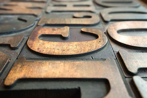
We recently shared tips on choosing the right font for your poster or flyer, but today we’re looking at business cards. The considerations that go into selecting the perfect typeface for your business card are totally different from the ones involved in selecting fonts for a larger project, but not just because of the smaller size. Business cards serve a different purpose, and the way you approach choosing your font needs to be different, too. Read on to find out more about selecting an appropriate font for your premium business cards.

Premium Business Card Fonts
Readability
It’s paramount to keep in mind how easy it is to read your business card when selecting a font. Remember that business cards are small, and therefore your text should be appropriately scaled. Don’t select the largest font that will fit. As we’ve mentioned before, white space is actually a good thing. Aim for a font that maintains its readability at 10 or 12 point.
You don’t want your readers to struggle to decipher your name written in a fancy script font. A clean, geometric font is easiest on the eyes. Don’t be tempted to choose a very thin, narrow font for your business card. It is important for your font to fit on the tiny card, but it shouldn’t look as if it has been shrunk down or squashed. Lastly, choose a colour that stands out against your background. A white font against a dark background or black font against a lighter colour typically work best.
Match Your Industry
We can’t stress this point enough: your business card font should reflect the type of work you do. If you’re in a traditional, formal field, like law or finance, you should stick to a very basic font. Opt for a typeface that you would also use on a resume or cover letter. Fonts that are too swirly or modern simply don’t give the right impression. A conservative font shows that you are serious about the work you do and therefore, others will take you seriously, too.
However, if you’re in a more creative field, it’s okay to have a little bit of fun with fonts. There’s a plethora of options out there, and many are eye-catching and memorable. Fonts that look like old typewriter print or architectural lettering are easy to read while also being unique. Fonts that look like handwriting are a good fit if you work with children or want to convey that you have a playful personality.
For more tips on creating an appropriate business card for your industry, read our previous article on how to make your business card stand out. For the best business card printing in Melbourne’s CBD, come on in to Spencer Minuteman Press. Our team is ready to help you design and print your perfect, stand-out business cards.


