We’ve written articles about creating the perfect logo and using visual images to improve your business. Now we’re going in-depth about one important aspect of graphic design: symmetry. Broadly speaking, symmetry is the balance and correspondence between different things. Symmetry is a powerful tool in graphic design. It can be used to create harmony and lend an air of stability, or it can be used to surprise and excite the viewer.
Reflection Symmetry
When most people think of symmetry, a reflected image comes to mind. You probably first learnt about symmetry by creating mirror images in primary school, finger-painting an amorphous blob and then folding it in half to create a butterfly. And there’s a reason why schoolchildren learn about reflection symmetry before any other type—it’s the easiest and simplest form of symmetry.

Reflection Symmetry in Graphic Design
You might want to choose reflection symmetry in your graphic design if your priority is to make the viewer feel comfortable. As it’s a classic way to design, it makes you and your message seem trustworthy. You can either reflect the image horizontally or vertically—it doesn’t matter. The end result will be a design that’s easy for the viewer to interpret, making them likely to spend time actually looking at it and internalising it.
Rotational Symmetry
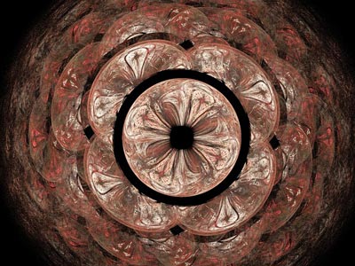
This sounds exactly like what it is: starting with an image and then rotating it less than 180 degrees. A pinwheel is an example of rotational symmetry. Rotational symmetry still helps to create a graphic design that comes across as organised and sophisticated, but it’s a little less expected than reflection symmetry.

Rotational Symmetry in Graphic Design
You might want to opt for this symmetry style in your graphic design if are planning to include a fair amount of white space. Rotational symmetry can help you to use blank space effectively, for example, allowing you to include text you want to highlight, such as your company name in the middle. If you’re looking for premium business cards that are super-effective, get in touch with Spencer Minuteman Press and let us help you create a powerful graphic design using rotational symmetry.
Asymmetry
Are you surprised to see asymmetry as a suggested symmetry style for your graphic design?! Believe it or not, asymmetry can be used strategically in really effective ways. Now, when we say ‘asymmetry’, we don’t mean a Jackson Pollock image, full of random paint splatters. Purposeful asymmetry can be used to exaggerate certain details in your graphic design, which will ensure the viewer focuses on the most important aspects of the message.


